Search

Saturday, March 31, 2012

Request: OC Refs Numero Trois

Another character ref I made for a friend.
Guess who's style I based off this character off this time!

Yet another ref I made for a friend for her RP OC. Her outfit is based off D-Gray man this time... or at least, the one on the left is. The one on the right was just a picture she pulled off.

The one on the right also is supposed to have a long braid, but I thought it would look more like a tail or something so I opted to leave it it out... but it's there.

Hopefully she'll be okay with that.

Other refs I made for her: one and two.


Made in SAI.

Thursday, March 29, 2012

More stuff I wear

Dressed up like a guy for a friend's project, though it was a bit excessive because I just sat behind a newspaper. I'm holding coffee because I was able to score a free one.

It was raining, sunny, and snowing all at once not too long ago.
This particular day, it was windy as heck.

First pic made in SAI.
Second pic made in openCavas.

Review-ish: SketchBook Copic Edition

Testing out SketchBook Copic Edition
While I was surfing Tumblr, I saw that SketchBook released a Copic Edition. Since I've got a thing with trying out new painting software, this was totally up my alley. Best of it, the program was free for a limited time and available for download off the Copic website.

I actually found it to be difficult to use due to the interface. It required a lot of holding and dragging, as opposed to just straight out clicking. I suppose it makes sense for tablet users - SketchBook being an app - but not so much for the desktop versions. I just found out now how to move layers up and down.
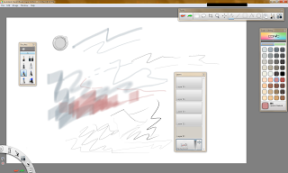
SketchBook Copic Editon interface
That aside, how about the important stuff like the brushes? Did I find them similar to Copics? I suppose, but it simulated all the stuff I didn't like about markers. One of which is the streakiness especially apparent from using chisel nibs. I hear that it's suppose to imitate the seven layers Copics need to achieve a nice saturated colour (something I've never heard about or noticed considering I own these markers). I'm not too much of a fan of the blurriness the brush nib gives when you press down on the tablet.
Did I mention I also really really dislike the Multiliner brush they have? It's too light, and resembles the lightness you would get if you erased over fineliner ink - one of the things I hated about doing lineart.

The palette is also very limited to 72 Copic colours, most of which are greys and peaches. I persoanlly don't mind being limited because it challenges me to be creative with layering colours to achieve a look a desire, something I already do have to face when using Copics traditionally.

Overall, the program's not bad. Not great either, but I can see how people would think it looks like Copics. I'll try to play around with it some more.

The frustration of having to relearn a new interface and my now ranging desire to draw lead me to switch to more familiar territory to satisfy my craving.
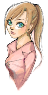
Derping around with openCanvas' watercolour brush. I never remembered it to be this nice. I quite like the way I coloured the sketch. I'll probably use the technique more for future reference.

...ignore the fact that the girl has a conjoined twin growing out her chest.

Monday, March 26, 2012

Oh hay, Blogger's got a new look

Vanilla sponge cake with strawberries
I baked a cake for a friend last week for her birthday. It's a shame that I never found out if the cake tasted good or not, because my mom kept bugging me for a piece when I was making it.
Did I mention I failed the first time and ended up making burnt egg custard instead?


And stuff I bought over the weekend at Michaels.
Canvas board, angular brushes, and Triple Thick glaze
I bought them brushes because I was tired of ruining my semi-good brushes with things like glaze and masking fluid.
I'm waiting for next week's coupon so I can pick up a more expensive item I wanted.

Moving on, I just updated to Blogger's new look. I don't mind how the front page looks; it just looks like a cleaner and bigger version of the previous homepage. The editing screen on the other hand... it kind of reminds me of something you would see in Buzzword (is that even what they're calling it nowadays?) or Google Docs. Less a forum you can type in, and more like an online editor. Don't know how I feel about it.

I know that I don't like how Google's trying to integrate everything with Google+ now. Google, man, no one is using Google+. I mean, I have it, but the only thing I've ever done on it was accept my cousin's invite to join it. Woo.

And Picnik's closing too.
...yeah, I don't care about that either.

Tuesday, March 20, 2012

Project: Bloody Mary Storyboards

Storyboards for an animation I'm making
Did it in like 2 hours the night (or really morning) before it was due. I pushed it off until then because I told myself, "Pfft, they're just storyboards. I can do that easily." Then I saw that I also required to do a couple seconds of test animation, and freaked out a bit.

Got her done, though. Nothing impressive.

Video made in Flash. Been a long time since I've made anything in that.

Saturday, March 10, 2012

Project: Luka Drafts

Drafts for my comic project. It's based of Luka by Suzanne Vega, which is basically a song about a girl shrugging off the fact that she is abused.


Now the alternative story. These pictures were supposed to appear when you hovered over the original story. It's supposed to depict Luka's ordeal the night before the story started, as well as reveal what really happened. Originally, I was going to integrate these scenes into the story linearly, but taking to the account that the theme of hiding and wanting to do something "different", I chose this gimmick instead.
And I don't think I've posted this yet, so I'll post it now:

Me brainstorming for the project before I even took the class.


Made in openCanvas
Last picture pencil on graph paper