Anyone looking for a video editor? Because I think I’d be a great one.
Showing posts with label School Work. Show all posts
Showing posts with label School Work. Show all posts
Monday, February 2, 2015

Tuesday, March 20, 2012
Project: Bloody Mary Storyboards
 |
| Storyboards for an animation I'm making |
Got her done, though. Nothing impressive.
Video made in Flash. Been a long time since I've made anything in that.
Saturday, March 10, 2012
Project: Luka Drafts
Drafts for my comic project. It's based of Luka by Suzanne Vega, which is basically a song about a girl shrugging off the fact that she is abused.


 Now the alternative story. These pictures were supposed to appear when you hovered over the original story. It's supposed to depict Luka's ordeal the night before the story started, as well as reveal what really happened. Originally, I was going to integrate these scenes into the story linearly, but taking to the account that the theme of hiding and wanting to do something "different", I chose this gimmick instead.


 And I don't think I've posted this yet, so I'll post it now:
Made in openCanvas
Last picture pencil on graph paper


 |
| Me brainstorming for the project before I even took the class. |
Made in openCanvas
Last picture pencil on graph paper
Monday, January 30, 2012
Look at all that hipster editing
 |
| Some guy basically thought this picture was about nosebleeds from the tissue. |
Remember my last post, the picture of the stuffed tiger, and how those were going to be what I was going hand in for my assignment photos but I chose to redo it last minute? Yeah, see how different my concept became now? I would ask if the theme was, but since I'm only showing one picture due to confidentiality issues, good luck with that.
Whatever, I liked this picture much better anyways. It was generally more well received by the class when I
Don't fret. I realized I didn't post a photo from another photography assignment I did a while back. I'm not posting the one I actually submitted due to more confidentiality issues so a reject will just have to do.
 |
| It's supposed to be a memory of hide and seek. |
Sunday, January 29, 2012
Back to the drawing board
Long story short, I was going to use these pictures for my final project, but four days before the due date, I decided to redo everything from scratch.
Try figuring out what the theme is because my TA and prof sure couldn't.


BONUS PIC: Basically, what we had to do for this rushed in-class assignment was to make a collage in Photoshop. So with all the Photoshop editing powers invested in me, I made this. Even though this isn't as awesome as an uncropped picture of a piano in an over-pixelated forest, I still think this is pretty great.
Then I read how the collage had to be "realistic".
Try figuring out what the theme is because my TA and prof sure couldn't.


 |
| That is Eernie btw. |
Saturday, January 28, 2012
I'd like to just stick to taking ghetto pictures on my phone
Oh hey, more school work. Of course it would be because when else would I be taking photos? Well, don't worry, because I won't be taking them for that much longer. Thank god, because I have no talent for this.
The point of these pictures was to exercise what we learned about composition by photographing two series of photos of two different scenes, where all you're able to alter in your camera angle. I'm not a photographer, but I hope you like my photos anyways.
Series one is a flower pot.

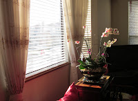

And series two is a glass vase.


There was zero editing involved other than some cropping. Basically all I had at my disposal was a camera and the sunlight.
The point of these pictures was to exercise what we learned about composition by photographing two series of photos of two different scenes, where all you're able to alter in your camera angle. I'm not a photographer, but I hope you like my photos anyways.
Series one is a flower pot.


And series two is a glass vase.


There was zero editing involved other than some cropping. Basically all I had at my disposal was a camera and the sunlight.
Monday, December 5, 2011
Project: Art Noveau Phantom of the Opera
I already introduced the topic on a previous a post, but in case you're too lazy to either click the link or scroll down, I'll recap for you:
So which draft exactly did we end up going with? The answer's none of the above, but a draft my partner put forward. I've never seen the movie before, but I think this is supposed to be based off the scene where the Phantom meets Christine at a mirror, and she realizes it's actually a door. I don't really know, I'm just getting this off hearsay.
And, without further ado, my final poster!
Sleep? What's that? I don't even know if you could count those two measly hours of sleep I got as actual revitalizing sleep. But yeah, if you already couldn't guess, I spent two all nighters on this thing just so I could get the impossible done and have this ready for presentation day, even though we wouldn't be able to print it in all 36" by 24" glory until much much later. I actually have the poster sitting in my room right now, ready to be handed in but can't because my TA isn't at school until Wednesday.
I've grown to have a greater appreciation for Illustrator and after doing this, it has opened my eyes as to what the program - or really Live Trace - can accomplish. Yup, I pretty much made all the people out of Live Trace.
Drafts made in openCanvas.
Poster made in Illustrator.
We had to pick a graphic design style (New York School or Swiss design, say) and were given the choice to either make a poster based on a movie or a famous place. I don't know how famous place got so many votes, because I know like one person who actually chose to do that boring thing.And there you have it. But before I post the actual poster, would you like to see some more drafts first?
Anyways, my partner and I chose to do Phantom of the Opera in the style of Alphonse Mucha.
 |
| A cleaned up version of one of the drafts, where I pretty mush centered and neatened things up a bit, as well as give you an idea as to what colour scheme we would be using. |
 |
| Our final second draft. Made her looking towards you a bit, widened the space allotted for the title, as well as added a text box for all the movie-like stuff like actors and what not. |
And, without further ado, my final poster!
 |
| Art Nouveau Phantom of the Opera Poster |
I've grown to have a greater appreciation for Illustrator and after doing this, it has opened my eyes as to what the program - or really Live Trace - can accomplish. Yup, I pretty much made all the people out of Live Trace.
Drafts made in openCanvas.
Poster made in Illustrator.
Art style poster drafts
Just dumping my first drafts I did for my poster project for school. We had to pick a graphic design style (New York School or Swiss design, say) and were given the choice to either make a poster based on a movie or a famous place. I don't know how famous place got so many votes, because I know like one person who actually chose to do that boring thing.
Anyways, my partner and I chose to do Phantom of the Opera in the style of Alphonse Mucha.


 I later on found out I was doing it wrong because I was supposed to draw all these drafts out on paper and not computer, but meh.
Made in openCanvas.
Anyways, my partner and I chose to do Phantom of the Opera in the style of Alphonse Mucha.


Made in openCanvas.
Sunday, December 4, 2011
Project: Automata
 |
| Our beautiful automata |
Yeah, our thing is pretty lame, but at least it's beautiful, dammit! That's all we have. We were able to secure a spot in the spring showcase from it, so I'm not ashamed of it at all!
I think after the horrible "definitely ugly" rating we got when we pitched our idea, we just strove to make my prof eat his words.
Thursday, November 3, 2011
Project: "Tipsy Jazz"
 |
| Magazine Spread Assignment |
(Though I sorely regret not going solo so I could make the magazine about horror movies or a hair magazine featuring Yu Gi Oh characters...)
Honestly, I'm freaking out about this project. Even though I'm done and can put it behind me, I have a really nagging feeling of impending failure. For one, it got super stressful the day - or really, last couple 'o hours - before the presentation due to issues that kept cropping up while I was finishing up the project. I think that's all I'll mention now, because the story is a long one. But part of it does include my partner. That's all I'll say.
Unfortunately, I don't think I should show my partner's page, because it's technically not mine's. I know it's a lame excuse, but I got a better one: I don't have a picture of it either.
Ugh. I hate this assignment, and I'm not proud of what I submitted.
Made in inDesign.
Thursday, October 6, 2011
Astrum: Demolition Technology
 |
| Logo |
Another big aspects of this project was the design of the business card and letter head. Personally, I think our card is pretty sweet.
 |
| Business card front |
 |
| Business card back |
 |
| Letterhead |
In the end, my TA convinced me otherwise. I bit the bullet, and I spent my night scheming up bullshit to relate our logo to explosives and not so much film and photography. Good thing my partner's particularly good at that.
P.S. Did anyone notice that our company is Russian?
Made in Illustrator and Photoshop (even though it should've all been Illustrator)
Thursday, September 22, 2011
Would you like some logos?
I think out of all the courses I'm taking so far this semester, graphics is probably my favourite. I like my prof, the concepts are easy to understand, what I learn is useful, and I like our assignments. Well, no surprise being interested in the arts, right? Good thing I decided to put it in my schedule. I wanted to give myself an easy course to ease my way into uni, you know?
Anyways, our first assignment is to make a logo for a fake company. Keyword: fake. Whereas other people were doing things such as book stores and bubble tea shops, my partner came up with a bomb shop. And that was that.
We were only supposed to have three drafts max - and for both of us - but I went out of my way to double that number.
Which one of these speak "bomb shop" to you?
Made in openCanvas.
Anyways, our first assignment is to make a logo for a fake company. Keyword: fake. Whereas other people were doing things such as book stores and bubble tea shops, my partner came up with a bomb shop. And that was that.
We were only supposed to have three drafts max - and for both of us - but I went out of my way to double that number.
 |
| It's supposed to be a grenade with a turtle shell pattern on it. |
 |
| Originally, it was going to be a bomb with it casting a shadow of a skull on the other side. Later on, I started liking the clean lines of just a rounded shape, as opposed to adding a fuse on top so I left it as is. I thought the star would just be cool to add in. |
 |
| There's a (lame) Yu Gi Oh 5Ds reference in the name. |
 |
| One of my favourite designs. It'll look nice paired with the bottom one. |
 |
| This could be like on a t-shirt or something. |
 |
| And now playing around with something a lot more simplistic. |
Made in openCanvas.
Wednesday, September 21, 2011
More creeper sketches
It kinda sucks drawing on the Skytrain because I don't take too well with motion sickness, drawing in a bumpy vehicle is difficult, and usually, there are either too many or too little people on the Skytrain to draw. Usually, I end up drawing the back of someone's head, which isn't exactly the most interesting thing to sketch. If I'm lucky, there'd be an ad with someone's face on it.
And now some stuff for school. Learning how to do some technical sketches. These are a lot more interesting than my assignments (practicing how to draw straight lines without a ruler, for example).
Like how I'm totally not listening to my prof and instead writing this? Priorities.
(This lecture hall is really really cold. Why is that?)
Drawn with pencil in sketchbook.
 |
| At least ads don't move. |
 |
| The best part is the dog. |
 |
| That's the floor plan of my living room on top, and some business card concepts for another class. And a fat croc. |
 |
| A poor rendition of my lovely Samsung Galaxy, and a better rendition of my hand. |
(This lecture hall is really really cold. Why is that?)
Drawn with pencil in sketchbook.
Subscribe to:
Posts (Atom)