Search

Monday, October 31, 2011

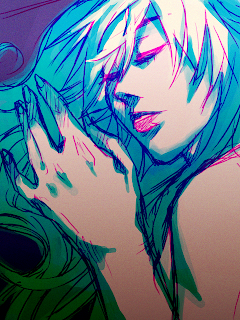
Wolf Girl

Wolf Girl
I pretty much recycled the style I used for Pumpkin Girl a couple of years ago, because it's easy and I'm short on time and motivation - but mostly time.

I used a bit more colours than I did, but that's okay because it compensates for the lack of detail and a good drawing in general. The two were supposed to go together nicely, but because of the simplicity of this one, it doesn't really work that well anymore.

Yawn. Boring picture is boring. I just wanted to do something for Halloween, so this is what you get.

You're welcome. :)


Made in openCanvas.

Sunday, October 30, 2011

Another year, another entry into a con mascot contest

AR... kun?!
Event File

I derno why I keep entering into art contests because I never win, orz.
Maybe it's just because art is the only thing I can do? I derno.

Anyways, another year, another con, which means another mascot contest. I usually don't enter into them because I'm intimidated by the fact that this is contest is, possibly, province-wide, and I'm pretty sure there's a really good artist lurking somewhere.

We were given the choice to do either (and I quote):
1.) Cute Pink hair girl
2.) Cute Pink hair boy
3.) Cute Pink hair furry thingy.
And I'm pretty sure I'm gonna win by default at this rate because - unless one got submitted since the last batch of mascots were posted - I have yet to see any male entries. Which is probably why I opted to go with the male mascot because I knew there'd be too many people drawing girls.
Sketch
I'll save you nice people from hearing me go on and on about, for example, how much I hate how the scarf came out and how I half-assed most of it, to talk about the con. Notice how I tentatively named him AR-kun and not AE-kun? Well, if you remember or care from last year, instead of Anime Evolution we had Cos & Effect. I'm still assuming that AE isn't going to happen in 2012 neither, thus comes this new con.

Get ready for Anime Revolution.
I see absolutely no relation to Anime Evolution. Nope, not even one.

When it was first announced, it was met with suspicion, but I think that's now subsided and it's welcomed as our new con for 2012. At least their planning abilities look more sound, as they've already booked a venue at the prestigious Vancouver Convention Center.

Of course, I already sent an application to be in Artist Alley.

On another note, I saw on Facebook that new staff has already been hired for AE so maybe we'll be having double cons this year?

And I know this has absolutely nothing to do with Halloween, but in the case that I never make anything for it, Happy Halloween evvrybody!


Made in openCanvas
Edited in Photoshop

Friday, October 28, 2011

Maybe I should've joined some sort of service club

Male and female heads in different angles.
Gesture drawings. It's a mess because I try to cram as much as I could.
Seem familiar? I know this anatomy chart by heart.
These drawings reminds me of the stuff I would produce for the manga drawing section I used to run last year as an exec for animu club. Maybe it's because I made them for a club I joined this year, Manga Academy. We didn't have an anime club at our school, so I had to settle with this.

But I also joined because when I asked them what they did, they said they all they did was draw, so I was sold.

I don't know how much I'll learn from this club, because they go over the basics when I need to help on more specific things. Not to undermine the execs artistic abilities - I'm sure they're probably better than mine's - but I think I need the professional eye of an art teacher to get me in the right track. You know, someone to tell me to stop drawing animu and such.

At least they used Loomis as a reference and not Christopher Hart.


Drawn with pencil on paper.

Thursday, October 27, 2011

Oh hai

I miss having an agenda to draw on, and doing the sort of pictures I would do in it. I like these abstract concepts I don't initiate very well, because details in pencil are fun to do. :D

More concepts of animals 'n things.
Oh hai, there, Hiei.
My descriptions are getting shorter and shorter as my creativity slowly deteriorates.

Drawn with pencil on paper.

Wednesday, October 26, 2011

"Definately ugly"

A fox... thing.
An idea for a new mural on my chalkboard wall. Obviously, the idea isn't very developed so it'll be a while before I get started on that.
What I do in my 5 hr breaks: I draw brides with guns.
An initial concept for our Alice in Wonderland inspired automata we eventually have to make for a class. In it, we're going to have Alice, upside down and stuck in a hole, her legs flailing, with the rabbit running around her. The Cheshire cat will be popping from the mushroom. I also have the sketches for some of the models.

I've got a funny story about the last picture. When we went up to present the idea to the class, my prof circled the "definitely ugly" section on the marking sheet because he couldn't understand why Alice was "upside down and obscured". Has he never watched Alice in Wonderland before?


Drawn with pencil.

Tuesday, October 25, 2011

Recipe: Pumpkin Squares

Pumpkin Squares
Honestly, I don't know why I didn't post this recipe sooner, because I make 'em every time I start seeing pumpkins popping up in stores. I guess it's kind of like a traditional thing now, like how people bake a bunch of cookies for Christmas. Except for me, I make pumpkin squares in October.

Basically, pumpkin squares are just pumpkin muffins baked in a square pan. This particular one is a bit plain because we didn't have any chocolate chips on hand. I might drizzle it on top if I ever get my hands on a bar.

And I know the picture doesn't really show it justice, with the clutter, and it still being in the pan (silicon ftw), and how it's already been nommed on, and just the whole fact that it could be anything tucked in there... Oh well, I guess you just have to trust me on this one. I draw, I don't take photos.

I used to take a lot of cooking classes offered in the community center when I was a kid, and that's where I got this recipe from. I think the class was a weekly baking class or what not. I was still elementary then, and I've been making this recipe ever since. However, my mom praised me for this particular batch of squares, calling it the "best one I've ever made", even though I really don't think I made it all that differently than from a year or two ago.

Pumpkin Squares
  •  1/2 butter (you could probably sub it with yogurt, I just didn't have any on hand)
  • 1 cup sugar
  • 1 cup brown sugar
  • 4 eggs
  • 2 cup pumpkin filling
  • 2 1/4 cup flour
  • 2 1/4 tsp baking powder
  • 1 tsp cinnamon
  • 1/2 tsp nutmeg
  • 1 cup chocolate chips
  1. Preheat the oven to 325 degrees.
  2. Cream the butter (if using), then mix in the sugars until evenly combined. Beat in the eggs ("until fluffy," as quoted by the recipe). Afterwards, add the pumpkin filling.
  3. Add the flour, baking powder, cinnamon, and nutmeg into the batter and mix until all the dry ingredients are moist. (Refer to muffin method.) Add the chocolate chips.
  4. Pour into a square pan and bake for 40 - 50 minutes (even though I ended up leaving it in the oven for an hour and a half... ick) or until a knife comes clean.
Anyways, I won't make you have to put up with more of my 3:00 AM crappy writing so bye bye.

Monday, October 24, 2011

Request: OC Refs Parte Du

Another one of my friend's RPG OCs.
The same friend who requested the previous refs asked for another.

This time, the character is for a Kingdom Hearts themed RP, hence the coat, which was referenced off Axel.
Cookie for the person who can guess who the character design is based off of. The hair's a big giveaway, I think.

Anyways, I haven't gotten the approval yet with the eye colours nor the design, as I didn't get the hex codes for reference this time. Hopefully, once I get this bad boy to recipient, she'll approve and I wouldn't need to edit and re-upload it, as well as write a comment about how I had to fix it.


Made in SAI.

Monday, October 17, 2011

The hardest class I'm taking right now is mainly drawing

We waste so much paper in class that it's not even funny.
What I do in class when I'm tired. I wish I could be that caterpillar right now.
Headshots. It's been a while since I've drawn anyone crying, haha.
Thought I'd throw some stuff here before it starts accumulating.


Drawn with pencil on graph paper.

Thursday, October 13, 2011

Hiei

Hiei
I was discussing Yu Yu Hakusho with my sister earlier, and I guess that got me thinking about the lack of YYH fanart I have - or really, lack of any fanart not relating to Vocaloid. That becomes quite an issue when you go selling prints when all you have are things people don't know about. Besides, I'm sort of in an artist's rut right now so relying on other people's characters would be of the best interest.


But back to Yu Yu Hakusho. I think they need some more fanart so I'll help by contributing. And since Hiei's awesome, I'm gonna do fanart of him first.


Made in openCanvas.

Monday, October 10, 2011

I can feel the wrinkles coming

Yukiko
Event File.

As well as a bunch of messages on my Facebook. I'm gonna have fun going through that.

But with going with tradition, I drew another picture of good ol' Yukiko for my birthday. This time, it wasn't half-assed and last minute. I spent a good three days or so working on it, though I still think I could've spent more time on the skin and refining the details and such. However, overall, I think it looks the most realistic and colourful skin I've painted thus far.

After all, I do these yearly paintings I guess to keep track of my improvement. I suppose that's why I didn't draw her all animu, as I have been practicing something similar to realism.

Sketch
But that's not all. Since I found out that the above picture doesn't look so great once shrunk, I did something more stylized for things like icons and such, because only my art can grace the face of my online profiles.

I love filters and layer styles. How about you?
Anyways, I gotta go find my cane so I can wash my dentures.


Made in openCanvas.

Sunday, October 9, 2011

Remnants of summer

All these pictures have just been chilling in my living room, waiting for the moment when I would upload them. So since all these pictures are so diverse, I don't really have much to say as an introduction, other than the fact that I did them all in summer.
Yeah, what am I going on about? You're not here to listen read me ramble. You people want pictures.


Sketches of various things I could see while on the couch. As you can see, most of it are body parts.
More body parts and some impromptu heads to play with facial features.
Something more cartoonish than what I usually do. I guess I'm trying to play around with geometric skeletons as opposed to my free handed figures. I also broke out my pencil crayons rotting in my room.
Some character concepts.
More concepts but this time of backgrounds.
...concepts, again.
Studies of pictures of naked people I find online, because that's how I roll.
Revamping some old characters. The guy's gonna get lung cancer one day if he didn't have awesome super powers.
Water colour fail. When I was trying to erase the masking fluid, it ripped the paper underneath it too. :(


Drawn with pencil on scrap printer paper.
Last picture made with watercolours and masking fluid.

Teal, I like it

Kenshin
I use too much turquoise/teal as of late, but when I start playing around with filters, it's always the blues which catch my eyes.

His hair is usually tied back, but I thought this time I'd allow him to be a little lazier with his appearance.


Made in openCanvas.

Saturday, October 8, 2011

Two-toned

Kanaria
I'm not a big fan of pop art, but the more recent stuff certainly have a certain pop art feel about them. Must be due to the bright, unconventional, limited colour palette, but as mention before, these quick sketches are my excuse to play around with things.

Originally, the colours were going to be purple and yellow, except after playing around with the hue and saturation filter, I thought this was more suitable for the type of character she is.


Made in openCanvas.

Friday, October 7, 2011

Recipe: Tiramisu

Tiramisu
When I was taking it out, my mom kept commenting how nice it looked. Damn right does it ever look nice. Especially with the ribbon around it, even though it was tied on really ugly, but it really needed that ribbon to keep the lady fingers in tact.

I originally made it for an ice breaker pot luck for one of the clubs I joined, but due to issues which included a being super tired and a dead wall clock, I missed it. Instead, I brought it over to a baby shower that was also scheduled for that evening, but I was going to miss in favour for my club. I don't think the ice breaker needed anymore food anyways, according to my friend who was there.

The recipe I used is a combination of a bunch of tiramisu recipes I found online. And even though I'm including a recipe for lady fingers, I only used that recipe to make the rounds inside it. The outer ones were store bought, and man, are they ever plain. They look so soft in the package.

Tiramisu 

Lady Fingers
  • 1/2 cup flour
  • 2 eggs, seperated
  • 1/3 cup sugar
  • pinch cream of tartar
Filling
  • 1 tub mascapone cheese 
  • 2 cups (500 oz) whipping cream
  • 1/2 cup powdered sugar
  • 2 tbsp Kahula
Syrup
  • 1 cup water
  • 1/2 cup espresso
  • 1/2 cup sugar
  • 1/4 cup Kahula
  1. For the lady fingers, beat the yolks until thickened and lemon coloured. Mix in the sugar, saving about 1 tbsp. In a separate bowl with clean beaters, whip the egg whites until they're frothy, then add the cream of tartar. Continue to whip till stiff peaks form. Quickly fold the egg whites into the yolks, then fold in the flour until combined. Pipe into lines or spread into a round. Bake for about 20 minutes in 400 degrees.
  2. For the syrup, bring the water to a boil before adding the sugar, espresso, and Kahula. Simmer until the sugar is fully dissolved. Put aside.
  3. For the filling, combine the sugar, Kahula, and mascapone cheese together. Gradually beat the whipping cream into the mixture with an egg beater until soft peaks form.
  4. To make the tiramisu, brush on the syrup on the lady fingers, and soak both the rounds in the syrup.  Line a 9 inch spring form pan with the lady fingers around the diameter, and place one lady finger round on the bottom. Pour about half of the filling before putting on the last round, and using the rest of the filling for the rest. Dust with cocoa powder.
  5. Let it sit overnight for a minimum of one day.
Yeah, my relatives were raving about how nice it looked, and how it could've totally sold for money. They even told me that I could quit school and start some kind of cake business (as a joke, of course). I don't mind building them websites or doing design work for money, because I know I don't suck at that, but baking? Eh, I don't know if I'll ever have enough confidence in my baking abilities for that. I wouldn't mind the extra money, though. 40 dollars a cake? I'm in.

Insomnia

Anaria
Man, I love doing these quick sketches. It's an excuse to play with things and like filters, colour combos, styles, and all that other stuff I usually never try out when I'm painting something serious (like the picture I'm working on now). Plus, I love like how my messy sketching lineart style looks.

But, I suppose the term "quick" is relative. It was quick compared to my more formal, portfolio worthy pieces, but it still took two-three hours of my time... time I could've been spending sleeping as it was like 3 AM when I decided to go through with it.

So in the end of the day (or really, morning), I went to bed at 6 on a school night. I was okay with it, though, because at least I went to class, as opposed to skipping it like I did last week.


Made in openCanvas.

Thursday, October 6, 2011

Astrum: Demolition Technology

Logo
I guess this is a follow up to a previous post where I had all my draft logos. I'm going to fast forward through previous drafts and just go directly to the final products. We decided to go with the red star in the ring, just cause.
Another big aspects of this project was the design of the business card and letter head. Personally, I think our card is pretty sweet.
Business card front
Business card back
 The checkered part of the star represents a hole I manually cut out before I handed it in.
Letterhead
Yes, I was this close to having to go back, replacing the logo with an older draft, and then reprinting everything during the day it was due (and admits the rush of all the other people who planned to print last minute)  all because my prof told me the logo was too generic and how she preferred the older one. If it was anyone else, I wouldn't shrugged and been like, "Meh, it's too late. Already got it printed." But this is the prof we're talking about. She even urged me to do it, saying it was worth the extra effort.
In the end, my TA convinced me otherwise. I bit the bullet, and I spent my night scheming up bullshit to relate our logo to explosives and not so much film and photography. Good thing my partner's particularly good at that.

P.S. Did anyone notice that our company is Russian?


Made in Illustrator and Photoshop (even though it should've all been Illustrator)

Saturday, October 1, 2011

Even when I'm not there, I'm still there

Killarney Anime Club Banner
Well, howdy there. Welcome to my first post of October.
...and that's all I have to say about that, really.

I'm pretty sure that most of you already knew that I was part of my high school's anime club as an executive last year. For those of you who didn't, well, are you really surprised? Obviously, I'm not in it now because I don't even attend high school anymore, but that's not the point. The point is is that I was asked to do the banner for club's day and I agreed, even though anime club is just one of those clubs which really doesn't need the publicity because we get a bunch of members on clubs day (it's the staying part which we have an issue).

Most time was spent on the girl and the boy. I used them as a guinea pig, in a sense, to find a simple, but sell-able, colouring style I could use for my prints as I know not everyone is into my painterly, messy style. I know I'm bending my uniqueness to suit other's taste, but that's how these kind of things works... until you get famous and everyone is pining for your stuff, anyways.
I found out that playing with filters is very useful.

As for the rest of it... yeah, it's as lazy as it looks. Just a whole bunch of splatter brushes in different colours, tweaks here and there, and voila! At least it's predominantly white, yet colourful, as instructed. Probably pretty eye catching, though it's not the couple which makes it so.

I drew another girl I was planning to add onto the banner, but scrapped it because I fell out of favour for her once I starting doing the lineart.
She was supposed to sit on the letters.
As a side note, I find it depressing how I'm having so much difficulty doing my homework right now. It's depressing because all we're doing is drawing, and school has managed to give me headache. Why, IAT 106? Why are you tearing me away from my love?
(Well, at least this is technical drawing and not creative, artistic drawing, otherwise that really would've been depressing.)


Drawn in SAI.
Edited it in Photoshop.